When I was a girl my mother studied art by taking a correspondence course and looking at famous artist’s work in books from the library. I have a vivid memory of she and I sitting together, when I was about six, as she was pouring over images of Pierre Bonnard‘s paintings. She marveled marveled marveled at the color –“Look, Barbara, he made the shadows lavender!” He became our favorite artist from then on. I don’t know if she ever got to see a Bonnard in person. She was so on my mind recently when I went with a friend to D.C. to see the Bonnard exhibition at the Phillips.
I studied at Tyler School of Art and am a proud graduate of PAFA. Lots of awards and grants have come to me over the years, and several wonderful galleries and art reps have managed to sell my work into private and public collections all over the country. It’s a good feeling when a painting finds its hom
I’ve studied with some great artists — Gladys Noble Wagner, Larry Bell, Richard Tullis, Garner Tullis, Tim Hawkesworth– and painted murals with Clarence Wood and Don Kaiser, the dynamos at the Philadelphia Museum of Art who brought mural arts to Philadelphia in the late 1970’s. Ask me more about this.
In the 90’s, in Santa Fe, my visual art practice expanded into storytelling, performance and writing. A wide open landscape will do that to a person. I’m still writing with the Santa Fe Writers Group — thanks to Zoom. I studied for many years with kids’ lit writer and illustrator Jennifer Owings Dewey, and told improv stories with the Listening Heart Storytellers, a secret group of badass women who are still meeting regularly. My first novel for the grade school set was published by Azro Press(Spring ’09). Learn more about The Magical Mrs. Iptweet and Mehere. It won three awards and I still get fan mail!
As part of my writing work, I developed a unique memoir writing curriculum and offer classes on Zoom in 6-week sessions. Learn more here.
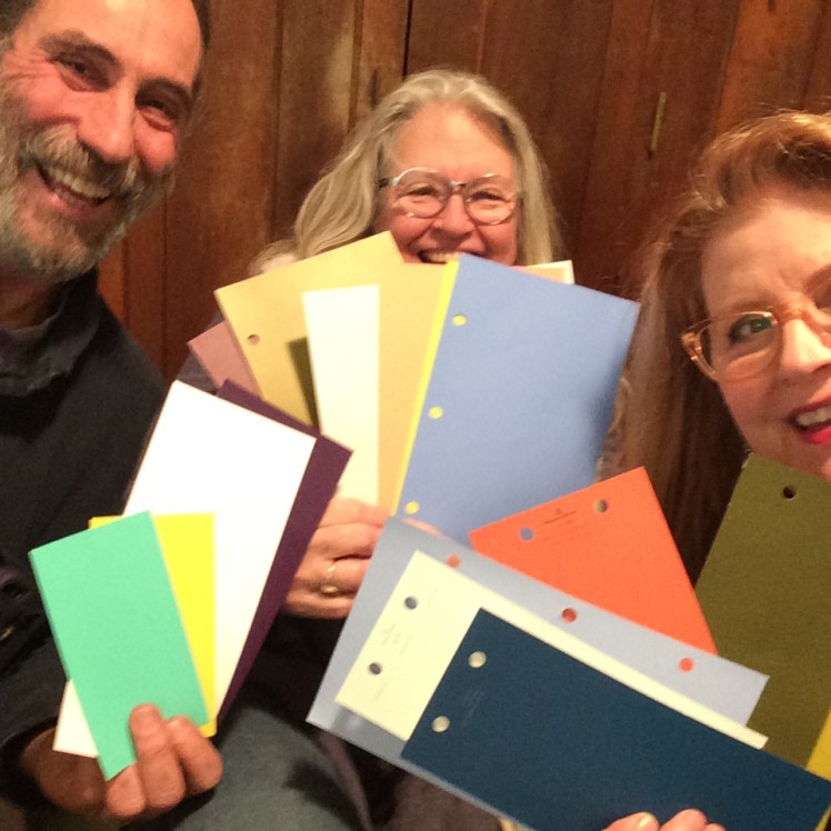
In 2013, after 21 years in New Mexico, Life brought me back to my hometown, Philadelphia, where my color consulting career was delivered to me on a silver platter. Eight years into this work and more than 850 projects under my belt, it is deeply rewarding to work with the wonderful people who find me, through word-of-mouth and online, in search of a professional colorist eye. Beauty in the home is crucial to our sense of well-being, and color has a profound impact on us. As it says on the color consulting page on this website, reach out to learn more, chat it up about your project, and book a consult.–BJM
Keep scrolling to see images from the studio and images from color consulting projects.
Send an email to book an initial free phone call. Tell us about your project.
Images from the studio and on-site color consultations:
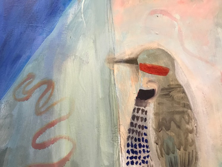
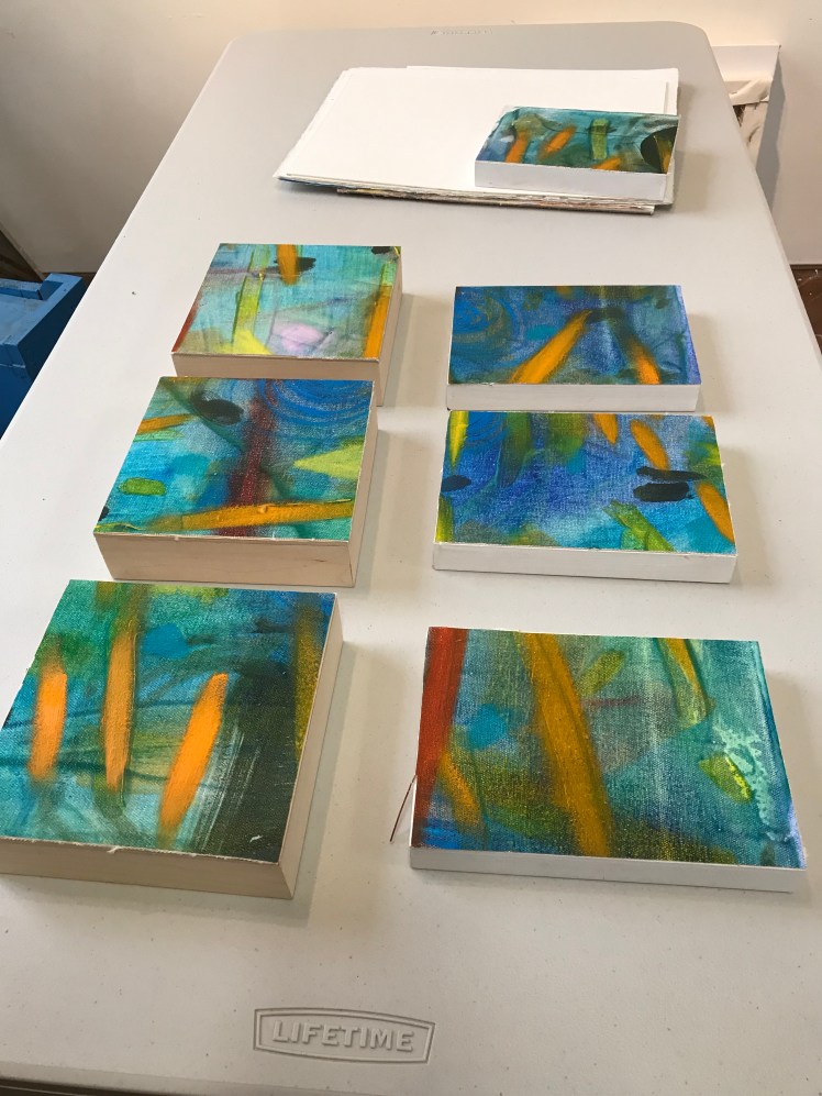
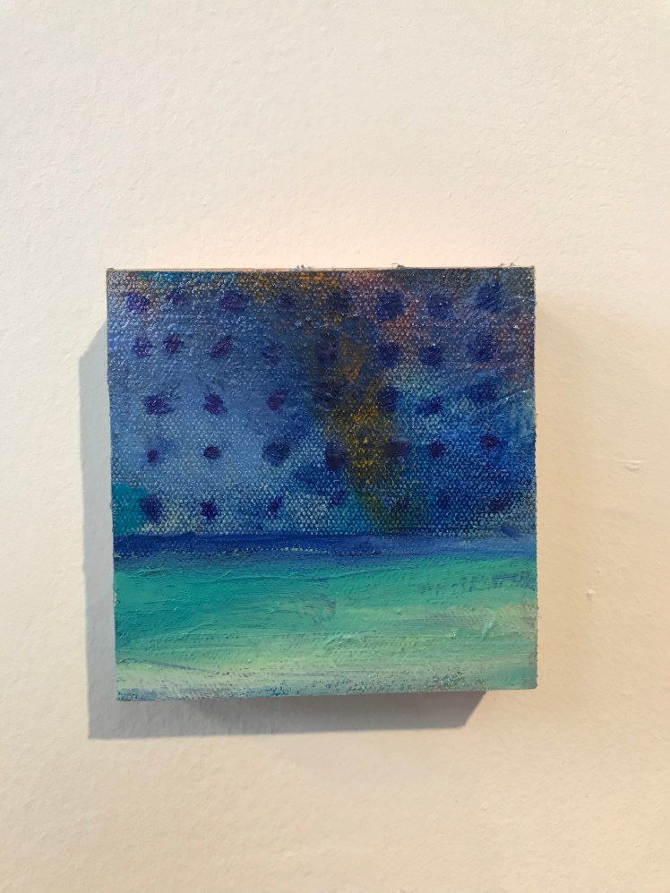
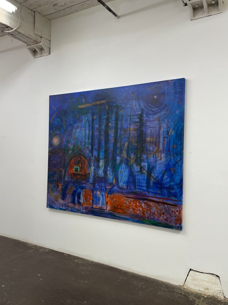
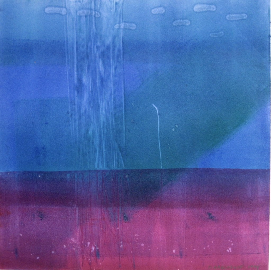
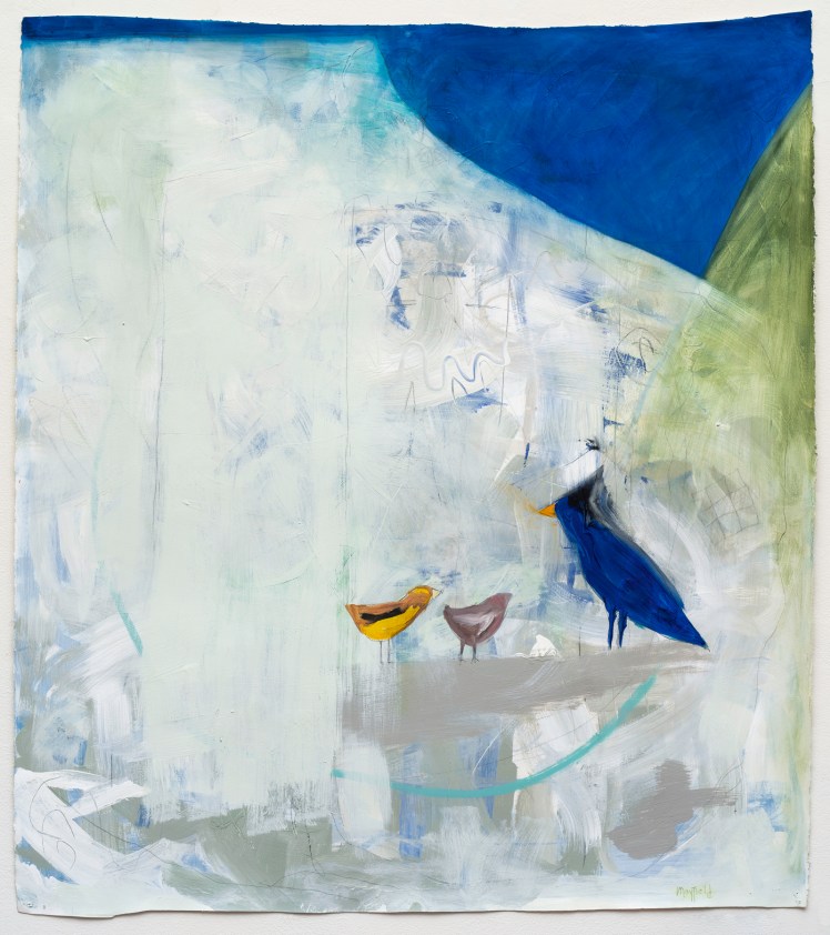
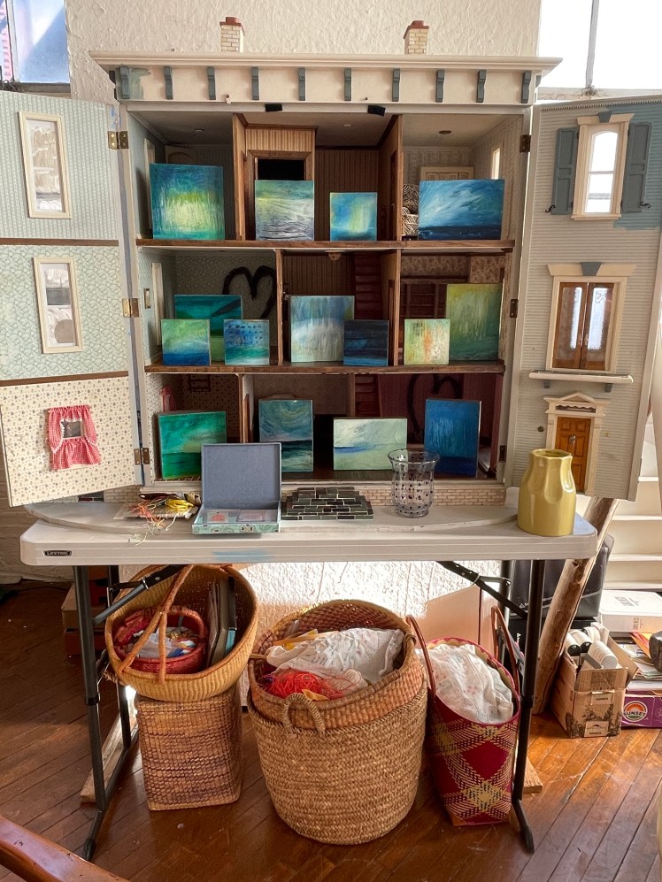
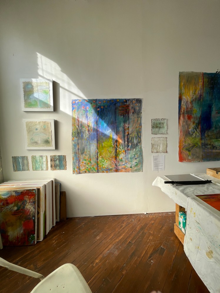
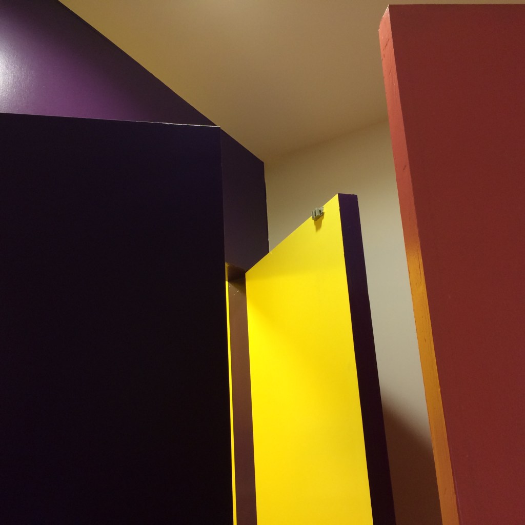
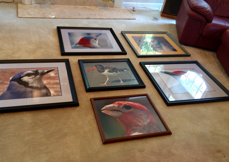
My Norristown studio is in a former costume factory with 22 other studios. Email me to make a time to visit.Fragment of the Night & Day painting in the LAND OF ENCHANTMENT Series -mixed media on prepared paper . approx 42×546’X6″s from the OCEANS Series, oils on canvas on panel 2020-22From the OCEANS Series: Night Sky – oil on canvas 4″x4″ Moon over Lake Absegami –oil on canvasMonotype from the AT THE EDGE OF THE WORLD Series. “First Ocean” 16×16 on Rives paper.White Mesa, mixed media on Arches, approx 48×54. aka Finch, Jay and GrosbeakDollhouse display of the small OCEANS paintings. Dollhouse reno in-progress.Everything is tidied up for Open Studio Day every December.
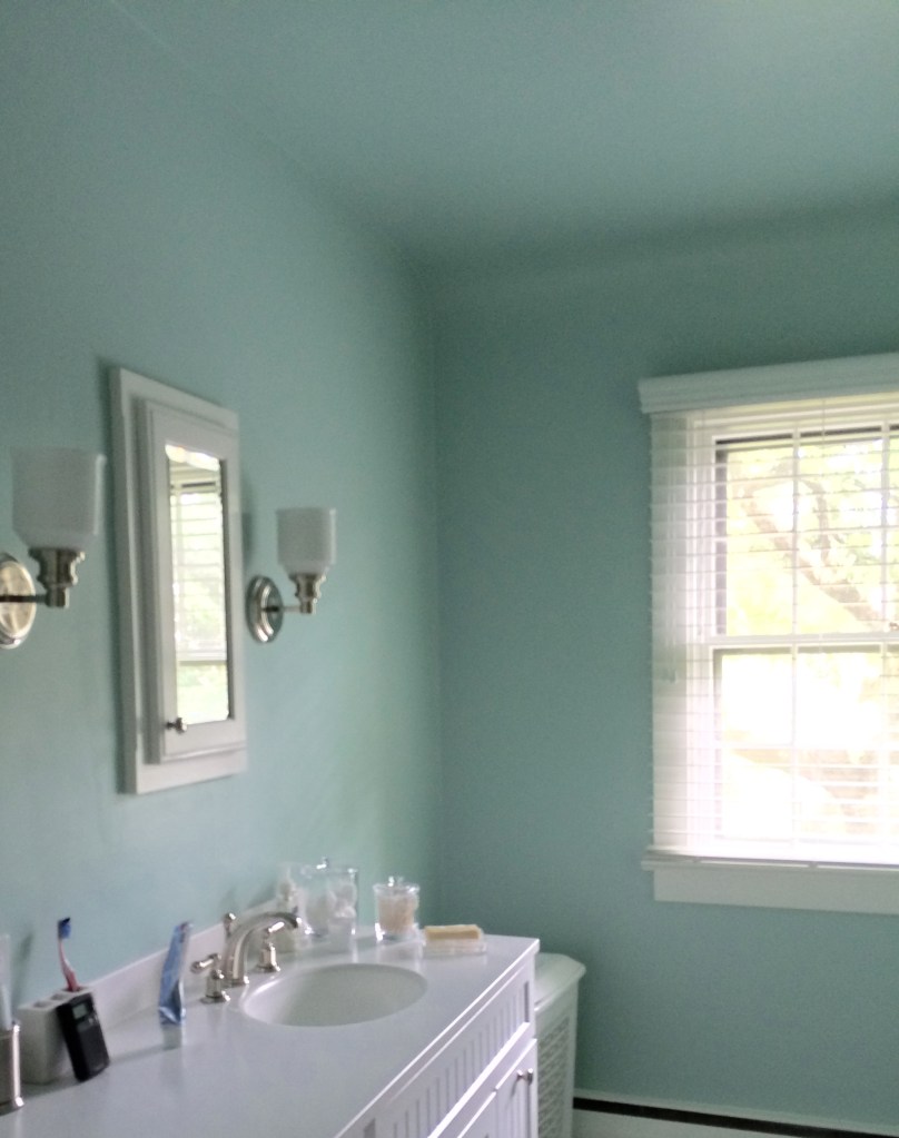
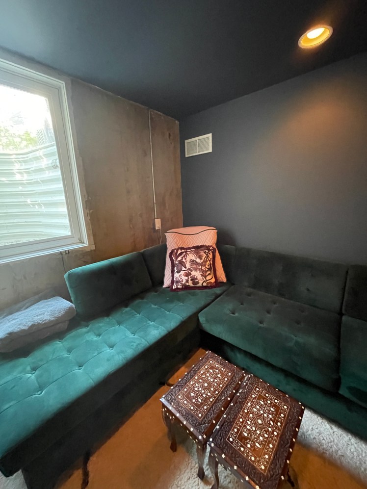
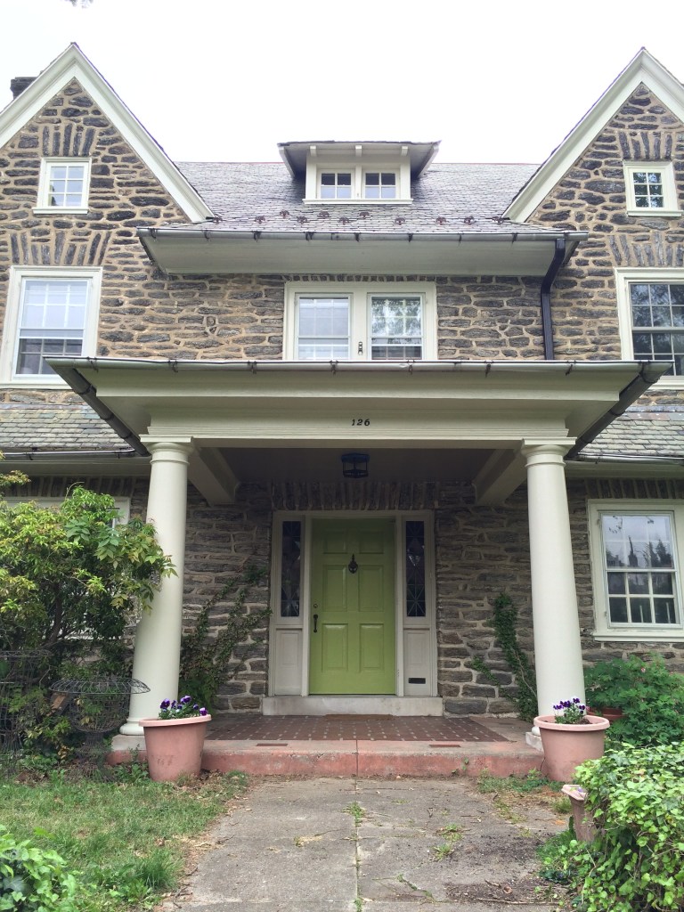
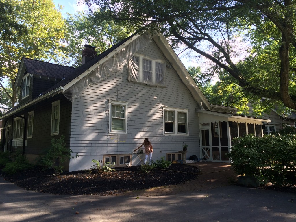
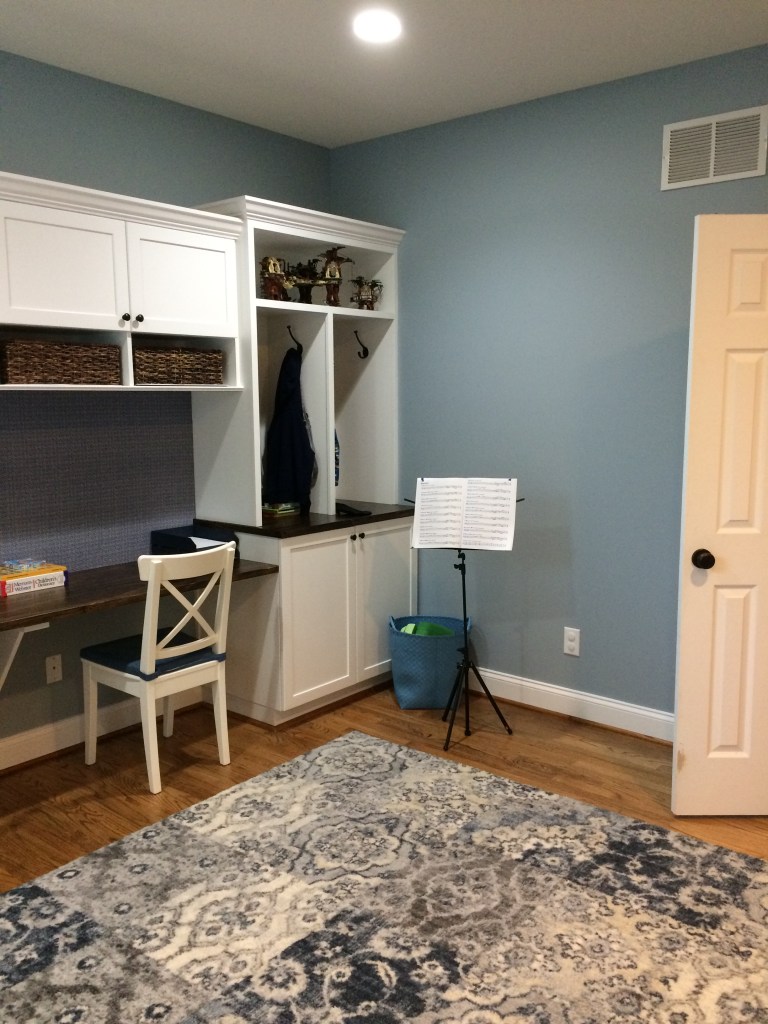
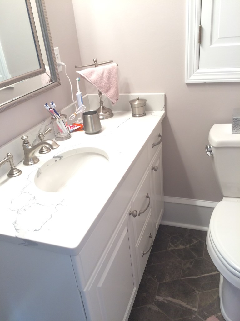
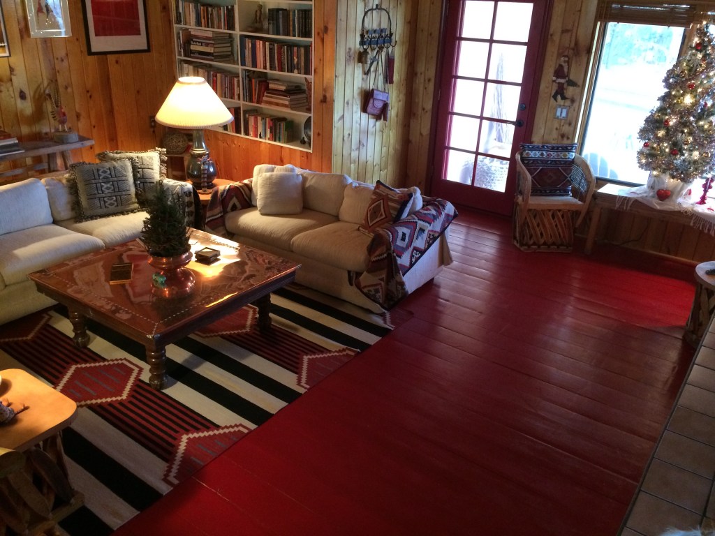
Images from a few of my color consulting projects:
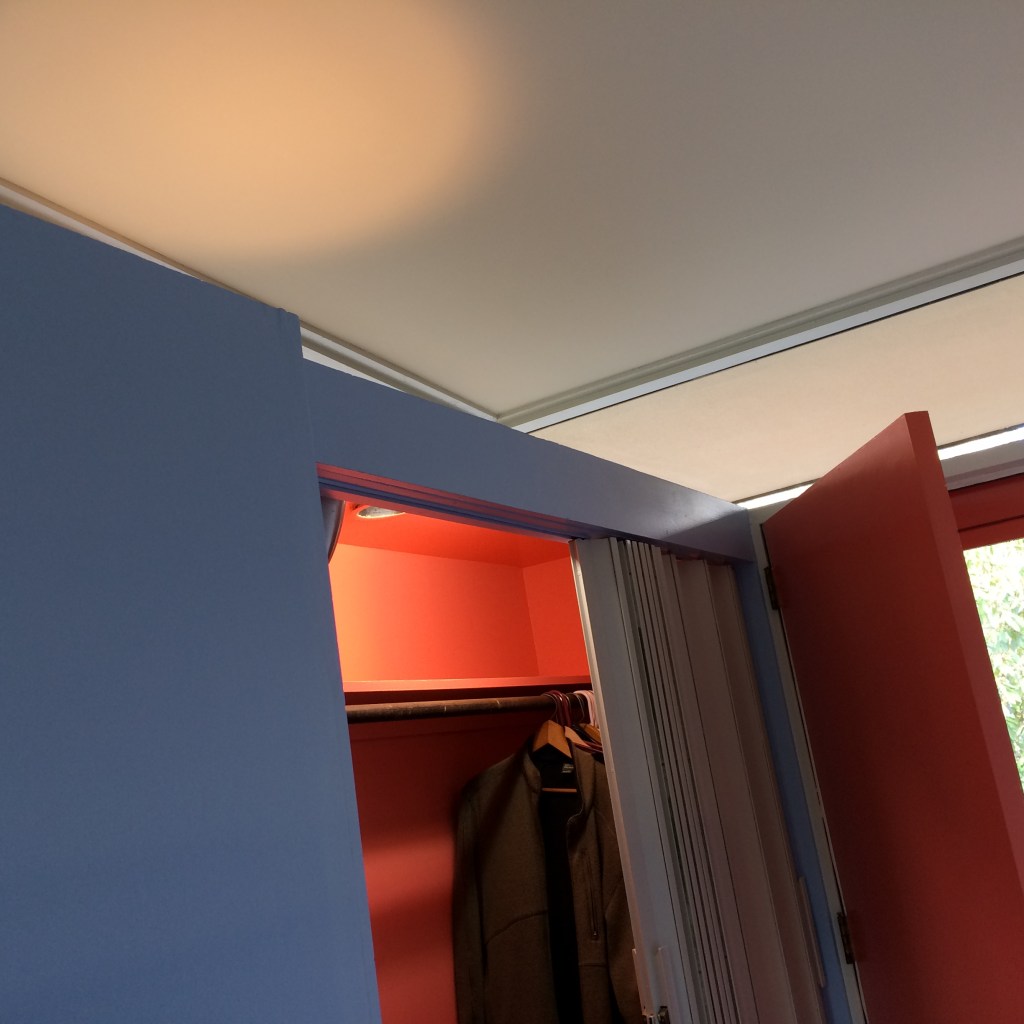
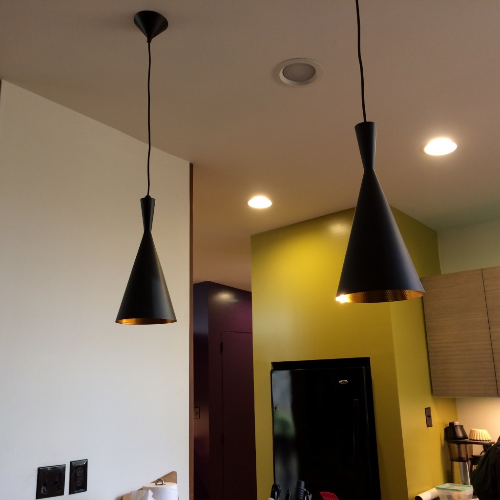
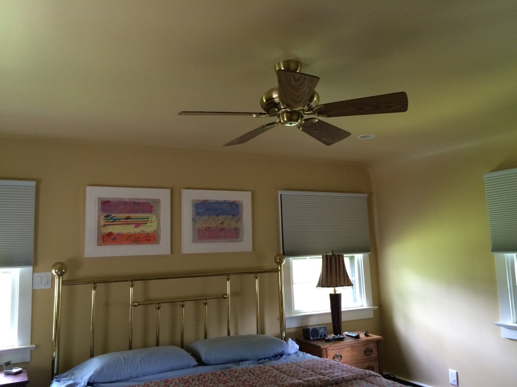
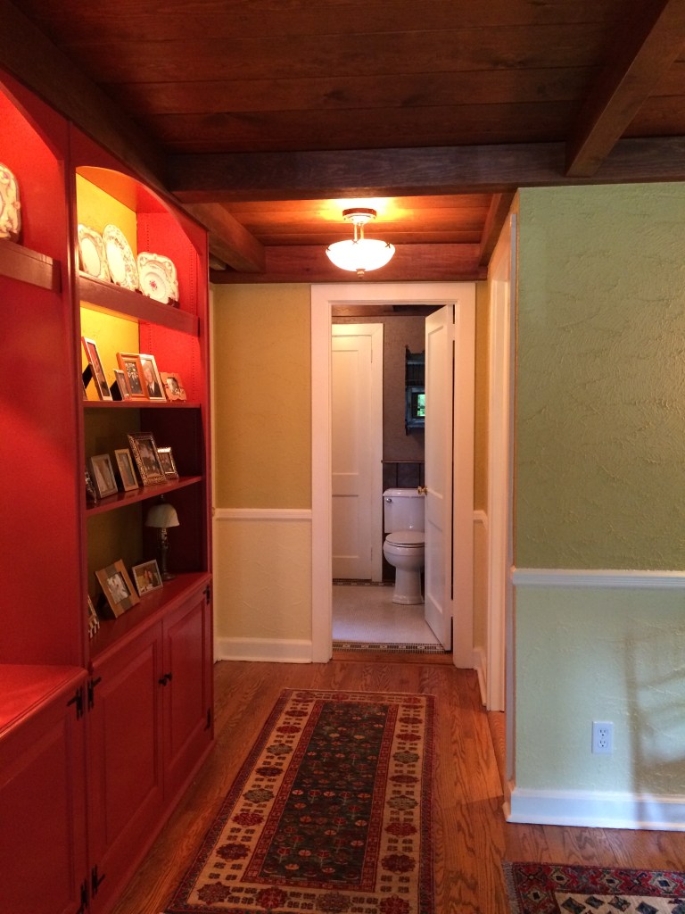
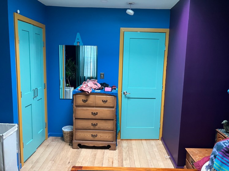
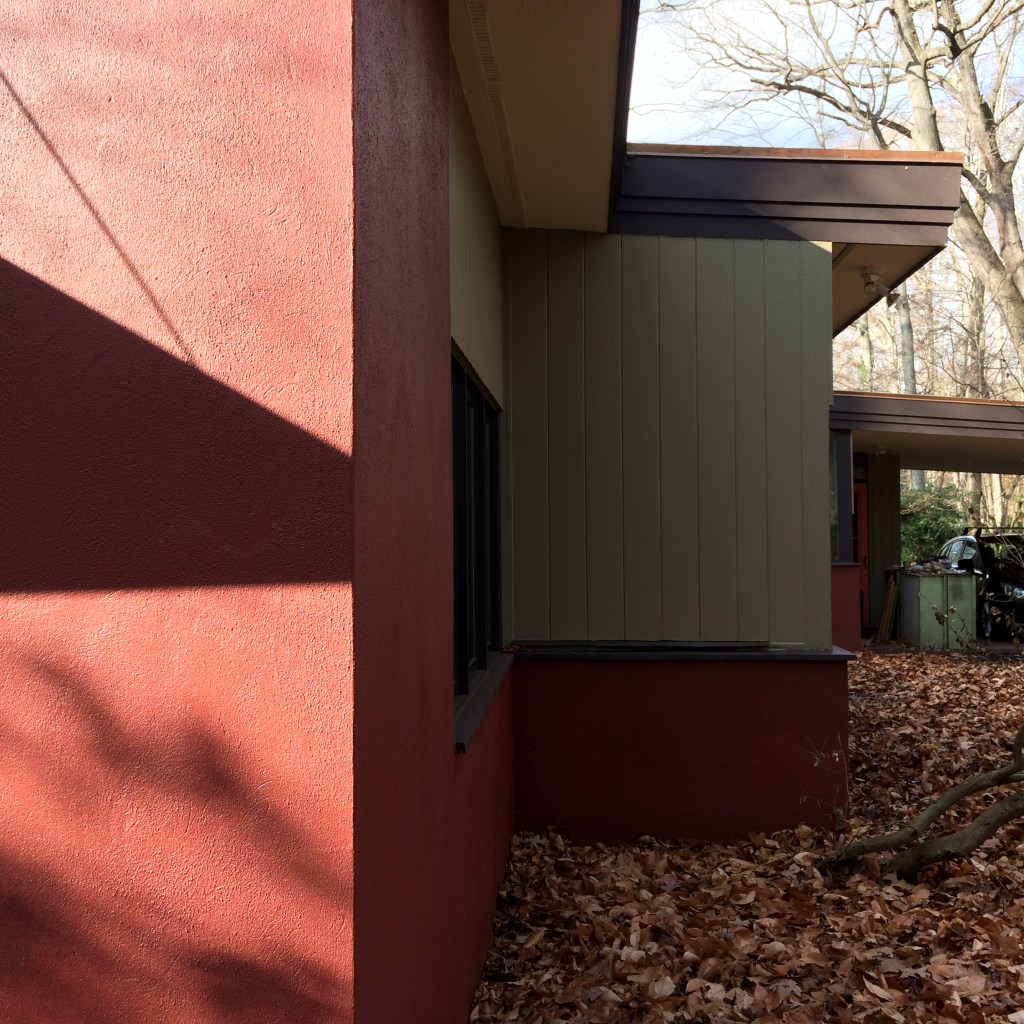
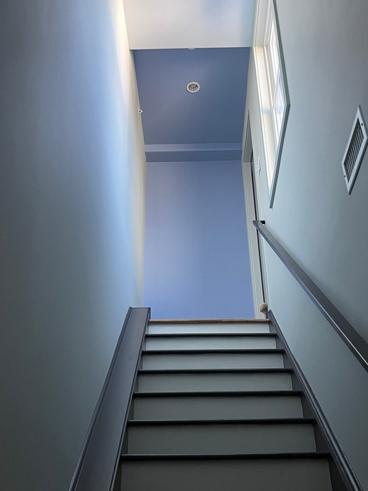
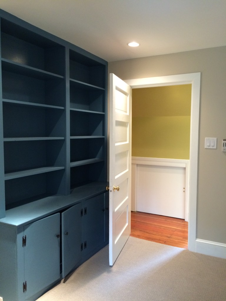
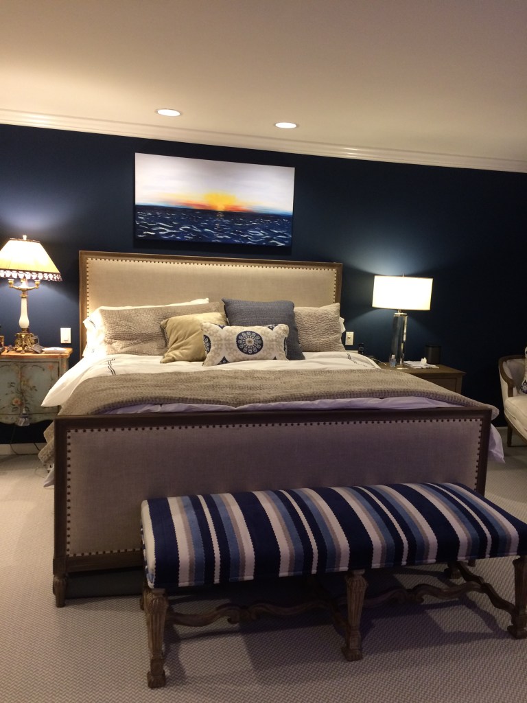
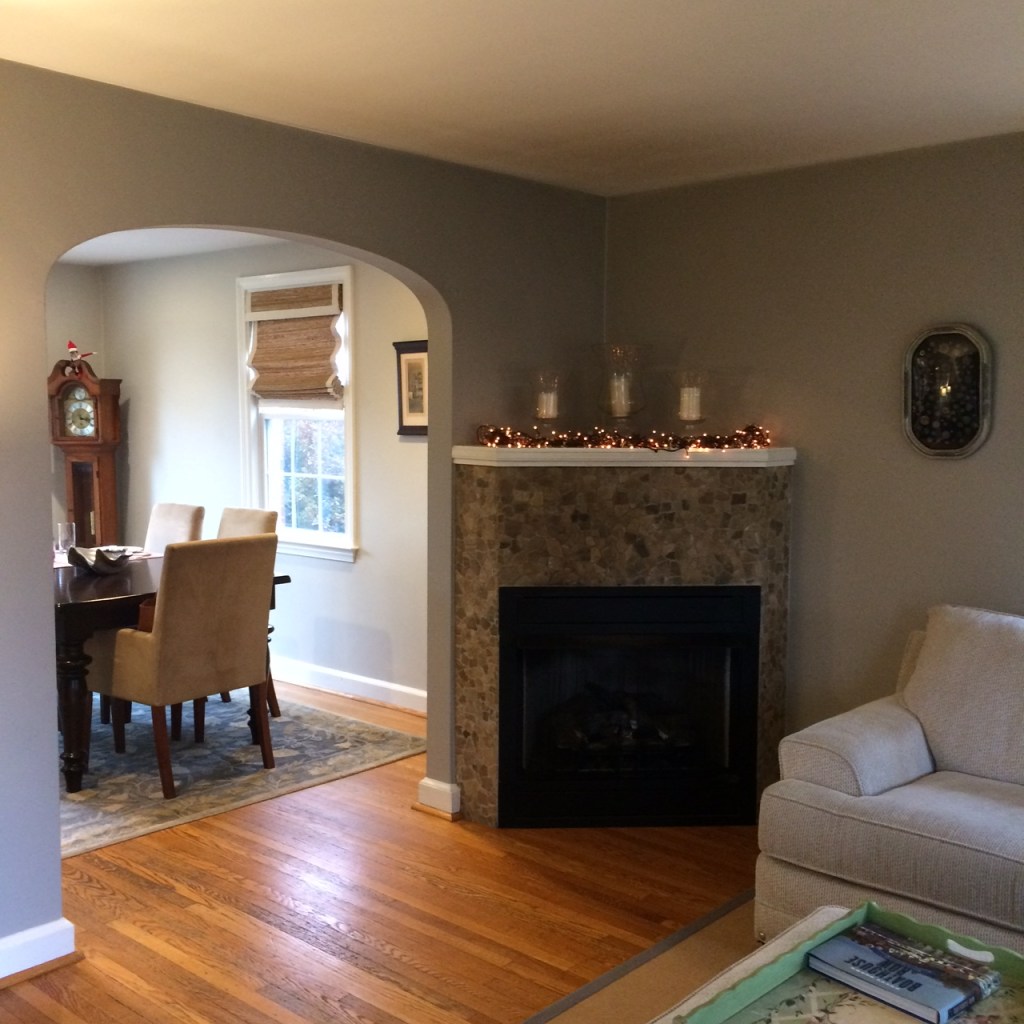
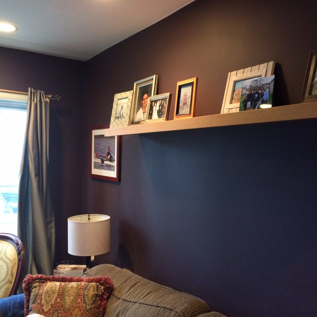
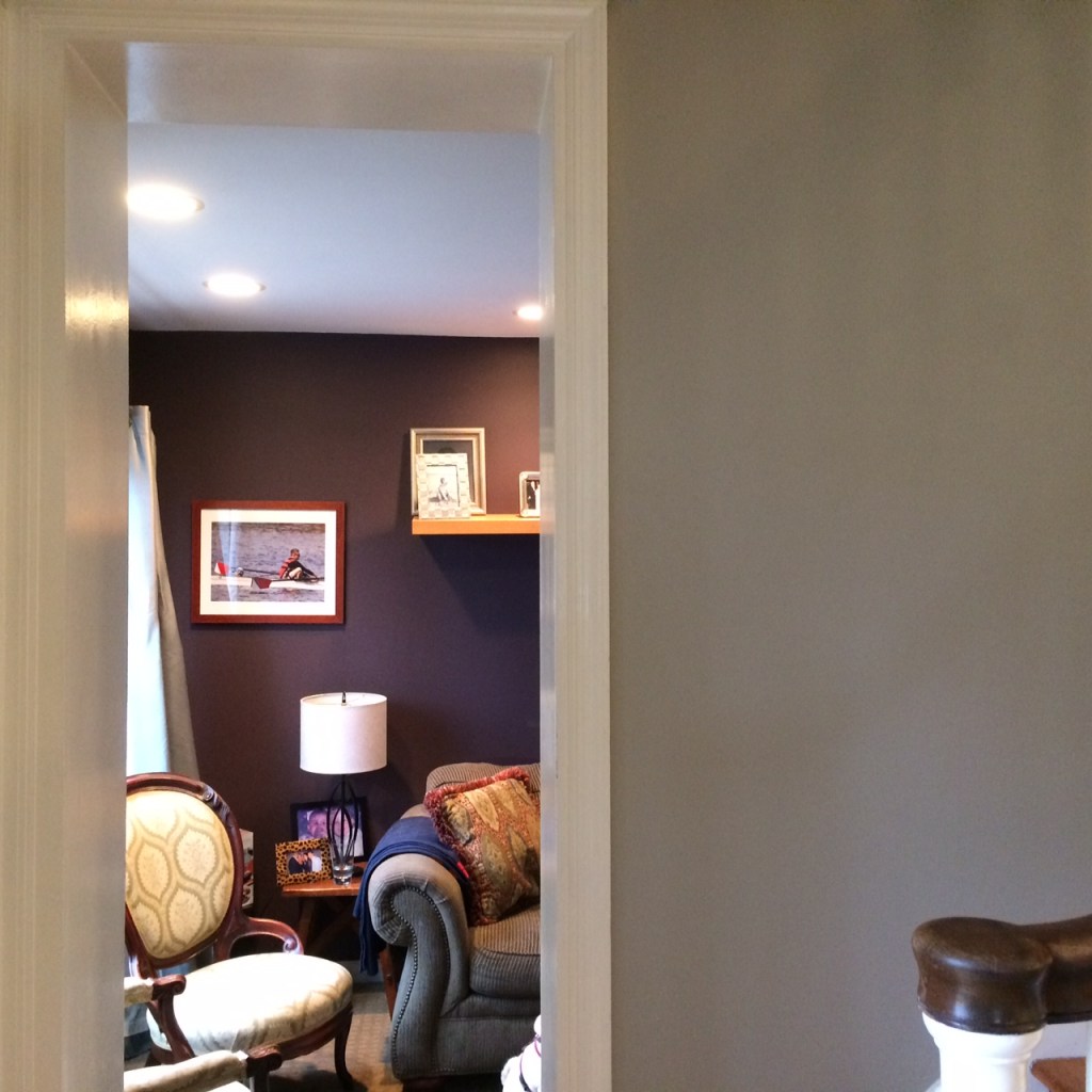
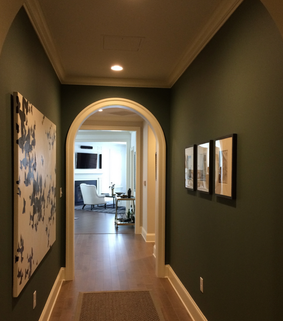
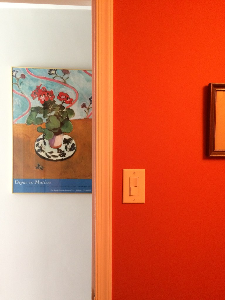
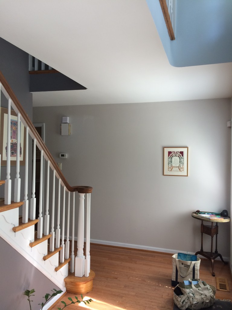
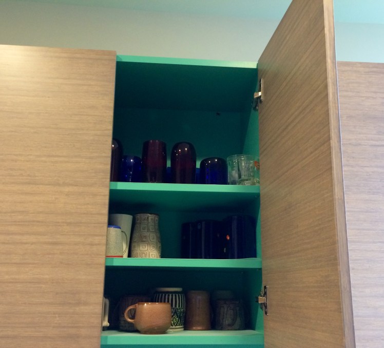
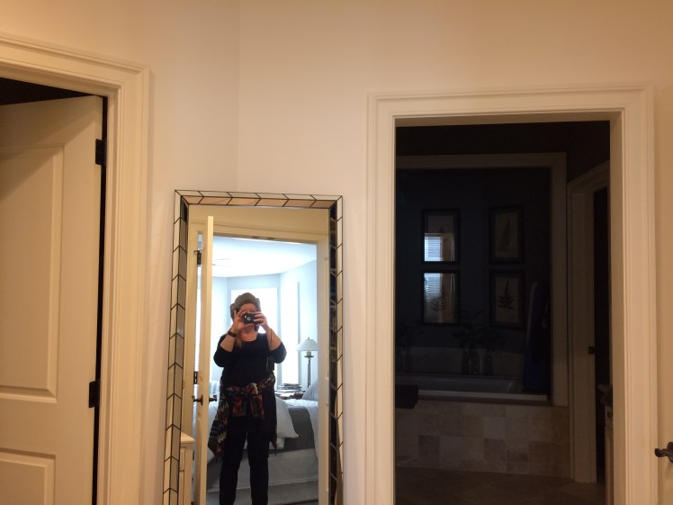
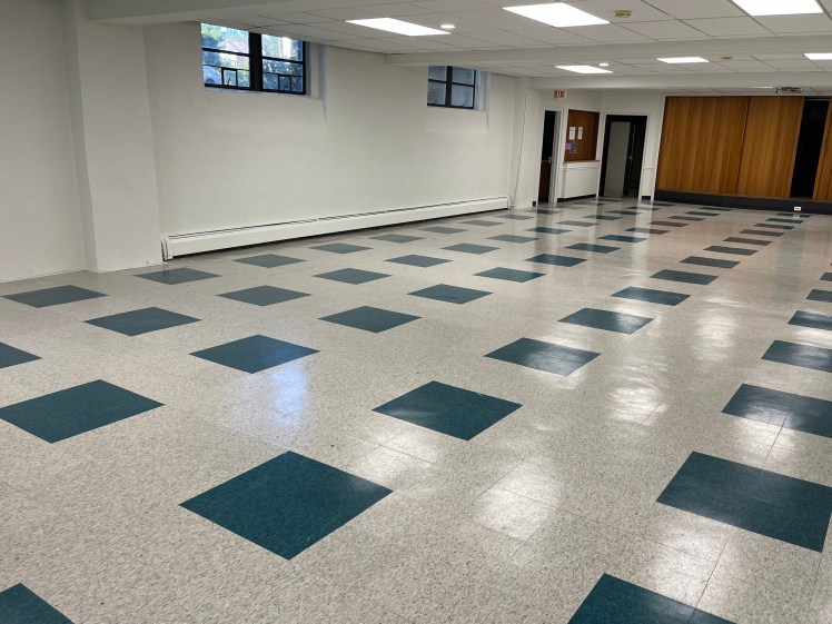
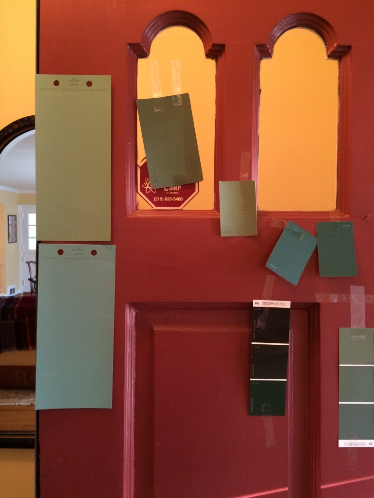
Clients J&A wanted a festival of color — even in the closets.Chartreuse and purple are great together when you are a couple of dynamic individuals.In a wooded setting, this house wanted to blend/meld/fit in with the landscape.Painting walls and ceiling in the same color gives a “held” cozy feeling to a bedroom.Clients G & C wanted a vibrant entryway to their carriage house and that historic red provided the vibe.Clients T & R wanted a “Mermaid at the Spa” feeling for this bath.For A’s basement office, we chose a deep, rich chocolatey grey that could holds its own beside that textured cement wall and the emerald sofas.Clients G&A wanted an earthy man-cave feeling with a “pop” for the stairwell and hall leading into A’s basement office. Yay!For this house, we let go of the old shutters and chose that unexpected greasy green for the front door.We had a long search for the perfect warm gray and white house set in a piney woods.For Client CJ, a creative, we chose that deep delicious plum and the turquoise to add more magic to that blue in the bedroom.We chose 3 colors for this exterior. The goal was for it to be in harmony with the woods but to be its own self.Never settle for boring laundry room walls. Never.Another view of that lively entryway using earthy historic colors.A long stairway leading to a roof deck, clients D and E wanted subtle and calm with a color surprise at the top. So we chose a soft grayish sage to lead up to that periwinkle pop.Always consider the floor color. This house had bright red-gold wood floors which led us to this dusty teal, a tawny neutral, and that goldy green in the hall. Client W wanted a soothing but rich wall color to work with the black door and grey flooring. We went with this strong griege with its plum undertone.J and P wanted elegance and drama in the main bedroom. With all the neutrals on the floor and linens and furnishings, we had our choice of deep shades. They chose a classic dark navy.Clients S and G were struggling to find the right neutral grey. In this case, the fireplace stone was in charge and we kept at it until we found the right warm griege that harmonized with the stone. Always respect the stone.Clients H and R were shocked at themselves when, after looking at many shades of middle-tone neutrals for this small room, they loved the deep dark plum for their TV/den room. Here’s a view into that cozy TV/den from the rich neutral walls in the living room.Clients G and F assumed the entry would be the same color as the hallways, but that big artwork needed drama on the wall and the entry became an event rather than a walk-through.Sometimes we take inspiration from the artwork when choosing a wild color for a powder room!Two shades of gray for this hall and stairway — one pale and warm, the other a rich grey with a noticeable plum undertone.Consider giving yourself a visual thrill when opening a cabinet door.It’s not often clients’ want 17 colors for their place — but these two dynamos did so we had a color festival over 2 or 3 visits.S & C wanted a calming, brainy color for their children’s homework room and this dusty blue with a drop of green in it won the day.A Dining Room and its Blue Ceiling for G & J.For her ensuite bath, we chose a mysterious rosy-lilac-grey for K.My very first color consult was in New Mexico — what color to paint the floor? Red.Wild can work. This house is a painting.Here I am taking a BEFORE shot. Color preferences are personal, powerful, and affect us deeply. Ditch the stress and let’s find your right colors. Arrange a consult– on-site or over Zoom.We planned out A and L’s artwork wall on the floor first. Church basement needed a lift badly — clients wanted it bright and clean in the most economical way. A bright but earthy white and new floor tiles in white and that beautiful teal did the job.An image of a process. The dusty teal color on the lower left won out.