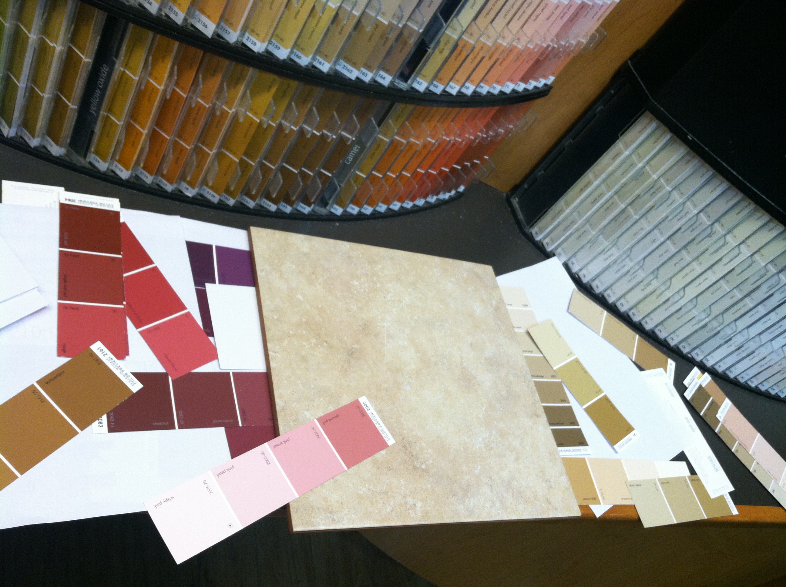
Client Peggy arrived in the shop with a humungous floor tile in a sort of warm golden yellow-tan-beige shade, that was going into a guest bathroom. White tile on the walls. White tub, sink, etc.
We tried out a few shades similar to the tile and after being bored almost to death with the matchy-match attempt, and seeing that there was an undertone of rosy brown going on, I shifted to a few deep cranberry-ish colors: Rouge 2084-30, Gypsy Love 2085-30, and Cherry Wine 2080-30. They worked beautifully with the tile, and no-color-fear Peggy didn’t run out of the shop screaming.
Guest bathrooms are a nice place to make a radical color choice. Why the heck not? The colors really popped and would make a dramatic, beautiful bath.
BUT, even though she liked the deep rosy reds, and the men in the family could deal with it she said, she had a shower curtain that she was using no matter what: an image of a flowering tree in the Japanese style – a brown tree branch and pink flowers.
That’s what we needed to be playing off of – the shower curtain imagery that she liked so much!!
So Peggy drove home and brought in the goods. Turns out the pink in the flowers was really several shades of a cool pink, a touch of coral and a great rose shade. The Ben Moore Rouge 2084-30 was a perfect match and that’s what Peggy took home. I love it when that happens.
Sometimes it’s a process to discover the important aspects to a room’s Beauty Factor are. What are you keeping, no matter what? Let it be something you love, that gives you joy.
Being an artist is not boring.
