A surprising number of people walk into the color chip part of the store and say something along this line, either under their breath or out loud, but always with feeling.
Because of this reaction to the glorious spectrum of visible color, I have a reason to live and a job to do. What’s the saying? “Bring me your overwhelmed, your indecisive, your fearful….”
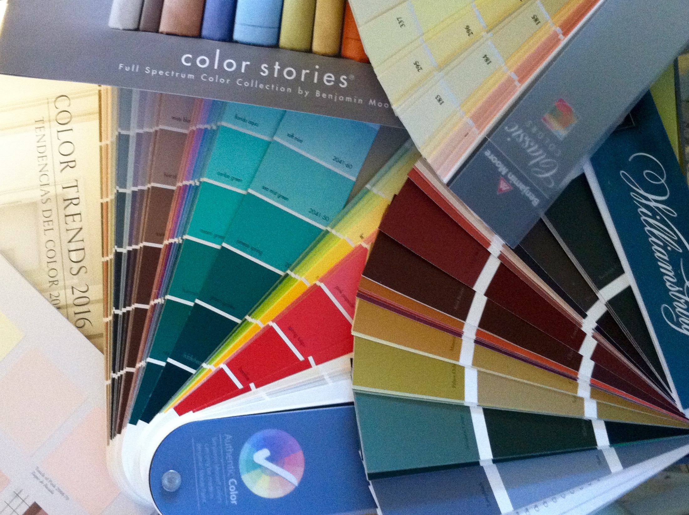
Have I mentioned yet what happens during an in-home color consultation? I bring my gardening bag full of fan decks of eight color palettes: the Benjamin Moore Classic and Preview collections, a deck of official Favorites and the 117 Whites and Off-Whites.
And I bring the Affinity palette. The Affinity colors are designed so that any three colors, even randomly chosen, will look good together.
I have the Historical Color (HC) deck and the Colonial Williamsburg(CW) colors. I must say the HC colors and especially the CW’s are very mature, elegant, and interesting. They seem to work very well in the houses of Southeastern Pennsylvania.
And then there is the deck of the most complex colors of all, the Color Stories Palette (CSP). Most colors are made with 3 pigments. CSP colors are made using 5, 6, or 7 pigments. No Black or Gray is ever added. Even the muted and darkest shades and the browns, blacks and grays are made from red, blue, yellow, green, the ochres and the burnt siennas. These are amazing, shimmering colors and are made only in the Ben Moore AURA paint formula.
I love my fan decks, but I digress.
Once I find a table onto which I set my garden bag and any other workbooks I may bring in, I start asking the big, fancy color consultant questions. Why am I here? What furnishings and/or rugs are staying in the space(s)? Are you open to considering colors you may not have thought of before?
And the most important question of all: what is the feeling you want for this room, this house, these rooms that flow together? Here are some the answers I have received:
“Inviting. Sophisticated, but not snobby.” (We chose several CW’s, a Classic, a Preview, an Affinity and a Favorite.)
“Artsy! I want wild and arty. Don’t hold back!” (O.M.G. His prayer was answered. We made harmonious arty wildness.)
“Cozy and comfy. I want to feel held.” (One room, one color from the CW deck. It’s a wow room now; lovely to be in.)
“Open. Airy. Light.” (Pale shades that are more than white and do not fade into gray-white.)
“Elegant, but rustic at the same time.” (We used a combo of CW’s and Affinity colors.)
“I want tropical, warm and colorful! I’m a color girl.” (We pulled from Classic, Preview, Affinity and WC for this house.)
“Soft. Calming. But not boring.” (Affinity and CW’s and one deep accent.)
The color decisions are made, the paint is purchased and rolled onto the walls and woodwork. And the transformation is a great happiness.
I see that my wonderful clients all want the same thing – for their houses to be beautiful reflections of themselves and their families. They want to create rooms in which they and their friends, and extended families, will feel nurtured and comfortable, relaxed, happy and even inspired.
Beauty and visual harmony such is a powerful thing. When the eye perceives color beauty, it relaxes. A happy eyeball relaxes the whole body. We all know that this is a good thing on every level for everyone. Let’s hear it for Beauty and Color Harmony!
Thanks for reading.
Onward,
Barbara
